






The Hilversum Sound
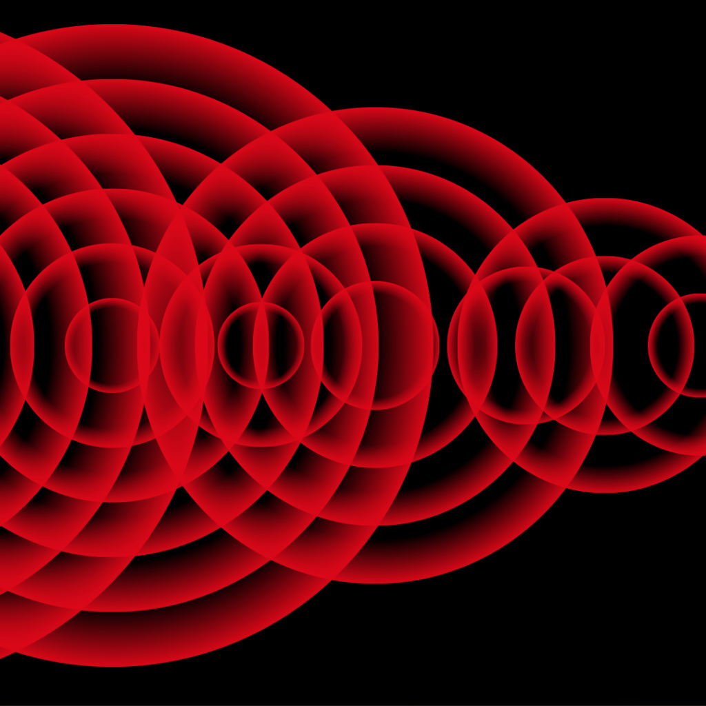
The Hilversum Sound As a hub for creative media, Hilversum is a key European player. Technically, artistically, and commercially. Sound plays an essential role in this landscape. Professionals in Hilversum record live performances and festivals that reach audiences worldwide, while major DJs, composers, artists, and orchestras compose and produce their music here. Challenge & Strategy The Hilversum Sound campaign showcases how professionals in the media and entertainment industry collaborate with musicians to create, capture, and distribute music. It highlights the process of composition, production, broadcasting, and performance, informing residents and visitors while offering interactive experiences such as exhibitions, behind-the-scenes access, workshops, mini-concerts, and a contest to create Hilversum’s own signature tune. Concept The design takes inspiration from musical elements: meter, rhythm, key, and dynamics, translating these into a distinctive and impactful visual language. The motion-driven identity was developed from moving visuals, which were then adapted into static designs. We also created an iconic logo based on sound, which constantly shifts in form, symbolizing the ever-evolving nature of music. This concept and design bring The Hilversum Sound campaign to life, providing a visual stage for the city’s vibrant music industry. metrum/grid ritme/herhaling volume/transparantie toon/vorm https://vimeo.com/1057491936https://vimeo.com/1057491916https://vimeo.com/1057491961https://vimeo.com/972903021 https://vimeo.com/686644597https://vimeo.com/972884853https://vimeo.com/972884620https://vimeo.com/972884718 Result The Hilversum Sound campaign visually captures the collaboration between media professionals and musicians, illustrating how music is created, recorded, and shared. Through exhibitions, backstage experiences, workshops, mini-concerts, and an interactive tune contest, the campaign immerses audiences in the sound of Hilversum, strengthening the city’s identity as a center for music and media innovation. More projects
Metropole Orkest – Welcome Jules Buckley
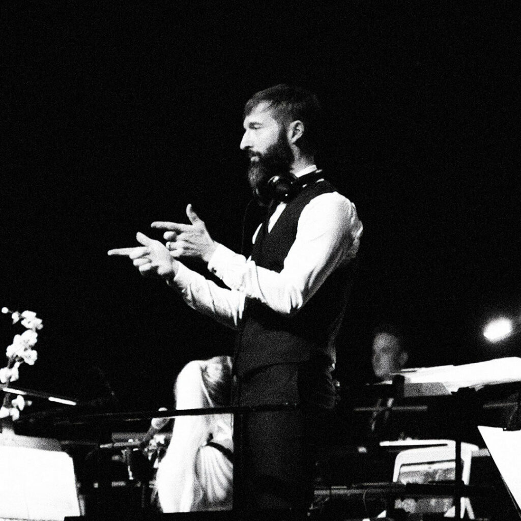
Metropole Orkest – Welcome Jules Buckley Metropole Orkest welcomed Jules Buckley as its new chief conductor, marking not just a musical shift but a new chapter in the orchestra’s identity. To highlight this moment, we developed a campaign documentary that visually captured his vision, his connection with the orchestra, and the significance of this collaboration. Challenge & Strategy For Jules Buckley’s introduction as chief conductor, we set out to make his distinctive musical signature and deep connection with the orchestra tangible. Instead of a formal portrait, we created a cinematic story that brought his energy, expertise, and relationship with the orchestra to life. The campaign documentary added depth to the introduction of Jules Buckley. Rather than a formal announcement, it became a visceral story, making his musical vision and energy tangible. The film was widely distributed, both online and in the media, ensuring that Buckley’s arrival was not just communicated, but felt. A welcome that went beyond words, perfectly aligned with Metropole Orkest’s core: music that moves and inspires. The result: an immersive film experience that takes the audience into his world. Concept The documentary takes viewers to Amsterdam’s legendary Concerto record store, where Buckley reflects on his musical roots and his vision for Metropole Orkest. By showing him in this environment, we painted an authentic portrait of the man behind the conductor. Cinematic conversations are interwoven with footage of rehearsals, performances, and the synergy between Buckley and the orchestra. This dynamic and personal storytelling approach not only informs but creates an emotional connection with the new chief conductor. ‘You know, nothing should get in the way of the art’ https://vimeo.com/1041152510https://vimeo.com/1041154430https://vimeo.com/1058140600https://vimeo.com/1058141788 Result The campaign documentary added depth to the introduction of Jules Buckley. Rather than a formal announcement, it became a visceral story, making his musical vision and energy tangible. The film was widely distributed, both online and in the media, ensuring that Buckley’s arrival was not just communicated, but felt. A welcome that went beyond words, perfectly aligned with Metropole Orkest’s core: music that moves and inspires. More projects
VVOJ

VVOJ – Association of investigative journalists The Vereniging van Onderzoeksjournalisten (VVOJ) is the leading platform for investigative journalism in the Netherlands and Flanders. It brings journalists together, provides training and knowledge sharing, and is committed to in-depth and independent journalism. To reinforce VVOJ’s role as a key player in the field, we developed a strong and recognizable visual identity. Challenge & Strategy VVOJ needed an identity that visually embodies investigative journalism; layered, sharp, and driven by nuance. We developed a system that not only represents these core values but is also adaptable across publications, events, and digital media. The classic magnifying glass was reinterpreted into a dynamic play of zooming circles, where text and images are revealed, a visual metaphor for investigative journalism: always analyzing, always digging deeper to uncover the truth. Concept The visual identity is built around bold typography and a distinctive color palette. The layering and movement of the circles reinforce the idea of an ongoing process of analysis and discovery. In some applications, images are treated to resemble highly magnified newspaper photos, with visible monotone halftone grids. This enhances the raw, direct aesthetic of the identity, ensuring it remains both striking and highly legible. https://vimeo.com/951454393https://vimeo.com/951454171https://vimeo.com/951454314https://vimeo.com/951453941https://vimeo.com/1057554009https://vimeo.com/951454012 Result From conference materials to online content, the identity supports and strengthens VVOJ’s position as the leading platform for investigative journalism in the Netherlands and Flanders. This visual language goes beyond aesthetics, it actively reinforces the essence of investigative journalism: sharp, in-depth, and always focused on uncovering the truth. More projects
NPO2
NPO2 – The in-depth channel You can’t watch TV in the Netherlands for long without coming across NPO 2. As the in-depth channel of the Dutch Public Broadcasting (NPO), it is impactful, independent, and socially engaged. Offering a window to the world, it challenges viewers to think critically and provides context on political and societal developments. To enhance its visibility across multiple platforms, NPO chose us as their partner in developing a new station branding. Challenge & Strategy How do you translate depth, insight, and perspective into a recognizable visual language? From the very beginning, we were involved in strategic sessions with NPO and Total Identity. The key insight: the depth that defines NPO 2 had to be present in every element of the branding. This led to a design system that puts content at the center. Impactful imagery, a restrained color palette, and an elegant visual style ensure that the branding remains both recognizable and timeless. The identity integrates seamlessly with the other NPO channels while clearly and consistently reflecting the core values of NPO 2. Concept The station branding focuses on the power of content. Documentaries, journalism, game shows, and art & culture programming are given space to breathe through strong photography and a refined visual style. A distinctive typography and subtle animations emphasize the layered storytelling that defines NPO 2. The interplay between static and dynamic elements ensures a branding that exudes calm, yet is flexible enough to accommodate different formats. Result The new station branding created a recognizable and cohesive presence across all platforms. The design integrates seamlessly with other NPO channels while clearly conveying the identity of NPO 2. The distinctive style, across image, sound, and motion, sets NPO 2 apart, with a dynamic graphic system that ensures a strong and timeless brand. More projects
Media Perspectives

Media Perspectives Media Perspectives – Innovation in the media industry Media Perspectives drives innovation and talent development within the Dutch media sector. As a knowledge and networking organization, it fosters new ideas, technologies, and collaborations between media companies, startups, and educational institutions. Challenge & Strategy To support its growth and positioning, we developed a visual identity that reinforces the platform’s forward-thinking role. Media Perspectives needed an identity that reflects its role as a connector and driver of media innovation, a system that is highly adaptable and evolves with the fast-moving industry. The visual language is built on layers and the interaction between content and technology. At the heart of the identity is the logo, serving as an iconic symbol for new ideas and perspectives. Concept The identity is structured around a flexible grid, where content blocks and graphical elements shift and transform, mirroring the continuous evolution of the media landscape. A combination of clean typography and a layered color palette creates a dynamic and contemporary look, perfectly aligning with the innovative role of Media Perspectives. https://vimeo.com/951434481https://vimeo.com/951434694https://vimeo.com/951434594 Result The visual identity provides a cohesive yet adaptive system, making it highly versatile across online publications, events, and audiovisual productions. This recognizable and forward-looking identity strengthens Media Perspectives’ position as a leading knowledge platform, bridging the worlds of media, technology, and talent. More projects
Evangelische omroep – Station
Evangelische omroep – Station branding How do you bring a brand to life? How do you create a seamless connection between television and social branding? And how do you give a brand a distinctive sound? The Evangelische Omroep (EO) sought answers to these questions and turned to our expertise to make motion design a central part of their visual communication. The foundation of the new identity, developed by Mensch Creative Agency, served as our starting point. We translated these elements into a dynamic motion design concept and a station branding that radiates warmth and connection. Challenge & Strategy A new identity requires a new station branding. The EO needed a warm and sensitive translation of their new identity into a motion design concept. Our task was to help shape this transformation. How do you make a brand move? How do you connect TV and social branding into a cohesive system? And how do you give a brand a distinctive and recognizable sound? These were the challenges we approached with our extensive motion design expertise. Concept A fluid color gradient from the new palette became the foundation of the animations. This subtle interplay of hues gave the brand an organic and inviting aesthetic. The logo animation was built around this gradient, giving it a vibrant and warm character. Beyond visual movement, we introduced a sound logo that translates the same warmth and depth into audio. A soft, organic glow that can be felt in both visuals and sound, creating a distinctive sonic identity for EO. Result The EO now has a station branding where visuals and sound reinforce each other. Motion design acts as the connecting element between television and social branding, ensuring a consistent and adaptive style across platforms. The combination of fluid animations and a warm sound logo makes EO not just recognizable but truly tangible in every expression. More projects
24kitchen

24Kitchen – Station branding In just a few years, 24Kitchen became a highly successful food channel. It was time for a refresh. 24Kitchen had grown rapidly and, after five years, needed a renewed identity to match its evolving audience. Challenge & Strategy 24Kitchen had grown rapidly. And, after five years, needed a renewed identity to match its evolving audience. With station branding, animations, and a custom sound logo, the brand became a sensory-rich, interactive food experience. The channel set its sights on inspiring young foodies; people who love to cook together, explore new flavors, and enjoy healthy, adventurous eating. Targeting an audience passionate about travel, food festivals, and outdoor dining. 24Kitchen aimed to become the go-to platform for food lovers. Concept A complete transformation. Together, we redefined the brand concept, developed a new identity, and implemented it into the station branding. The number 24 became a central brand element, reinforced by a refined logo, an expanded color palette, and an authentic, honest visual style. A strong graphic language introduced more dynamism, making the brand feel warm, inviting, and full of character. The logo became the heart of the brand, forming the foundation for an adaptive brand system. The new visual identity was rolled out across on-air, digital, events, and social platforms, ensuring a cohesive and engaging presence. Result The rebrand didn’t just refresh the look of 24Kitchen, it set it in motion. With station branding, animations, and a custom sound logo, the brand became a sensory-rich, interactive food experience. More projects