


The V-Factor:
A New Design for De Vorstin
Red Dot Award honors the visual transformation of Hilversum’s leading live music venue
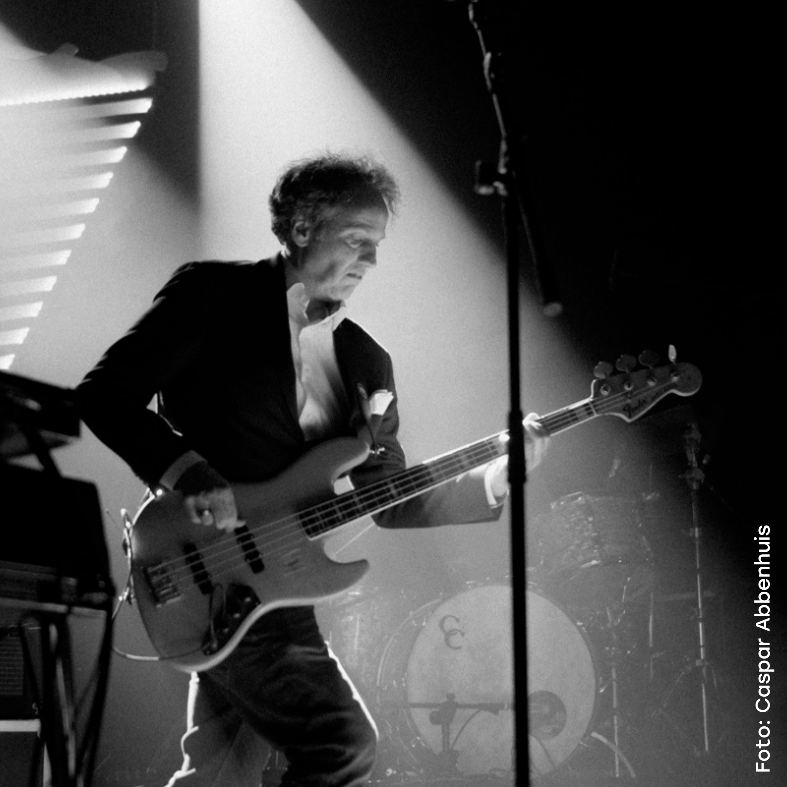
In the heart of Hilversum stands an iconic V-shaped building, home to De Vorstin, the region’s premier live music venue. Holland Centraal developed its new branding: a design that not only earned a Red Dot Award, but also gave the venue a powerful boost in recognition and presence within the music industry. We spoke with Wilco Witte, Managing Director of De Vorstin, about the transformation.
Recognizable quality
As the largest pop venue in the Gooi region, De Vorstin serves a broad and diverse audience, reflected in its slogan: “Not for everyone, but for all.” You have to love music, but beyond that, the range is wide: from raw emerging acts to established names.
That inclusivity demanded an identity that could hold it all together.
“As a regional venue, we address a very broad target group,” Witte explains. “That’s different from being, say, a punk club in a big city, where you can communicate more bluntly. Our tone needed to be more refined.” Over the years, De Vorstin also made major steps in professionalism, and its old branding no longer reflected that growth.
“There was this collective feeling that something new was needed,” Witte says. “A superficial restyling wouldn’t cut it, we wanted to dig deeper.”
The result is an identity that resonates with De Vorstin’s balance of quality and accessibility, complete with a workflow that allows the internal team to create all communications independently.
Triangles everywhere
The new branding is a dynamic system of lines and shapes that captures the energy of live music. “The animations reflect the movement and diversity of our programming, while also referencing Hilversum’s identity as a media city,” Witte explains.
At its core lies the V-shape, a nod to both the building’s architecture and the first letter of the venue’s name.. A key element is the simplified wordmark: Vorstin, without the “De.” The custom-tweaked typeface adds a distinctive touch, down to details like the slanted cut of the letter t, yet another subtle triangle. “This branding radiates the sense of class and refinement that fits us,” Witte says.
From recognition to impact
The results are tangible everywhere. First, in how the audience recognizes the venue’s visuals. “We hear far more people mention our posters,” Witte notes. “Audience research confirms that recognition.” But perhaps the biggest impact is within the music industry itself. “We’re standing stronger in the market,” he says. “Our programmers find it easier to reach out to agents and make deals.”
The rebranding bridges the gap between ambition and appearance, and fosters genuine internal pride. From programmers to technicians, the whole team feels represented.
The Red Dot Award is more than a trophy; it’s international recognition that De Vorstin now looks as strong as it sounds.