For Hilversum’s 600th anniversary, we developed a dynamic identity that unites heritage and the future. At its core: connection, cross-pollination, a city in transition, and, above all, a celebration for everyone!
Challenge & Strategy
Hilversum needed an identity that not only marked the anniversary but also connected and engaged the city. It had to be clear, accessible, and adaptable for widespread use. We developed a toolbox that allowed partners and event organizers to seamlessly align with the 600 Years of Hilversum visual style.
Concept
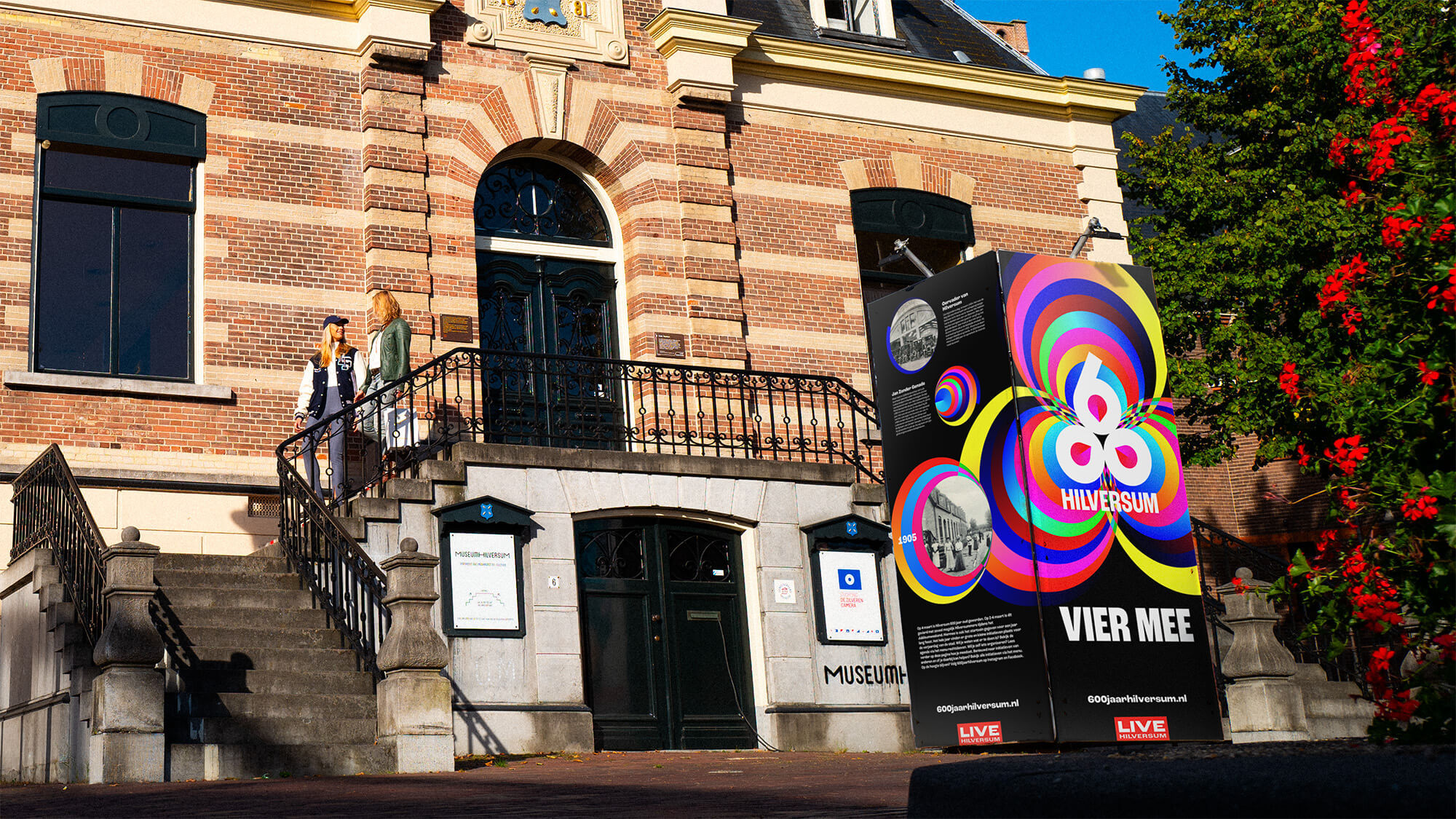
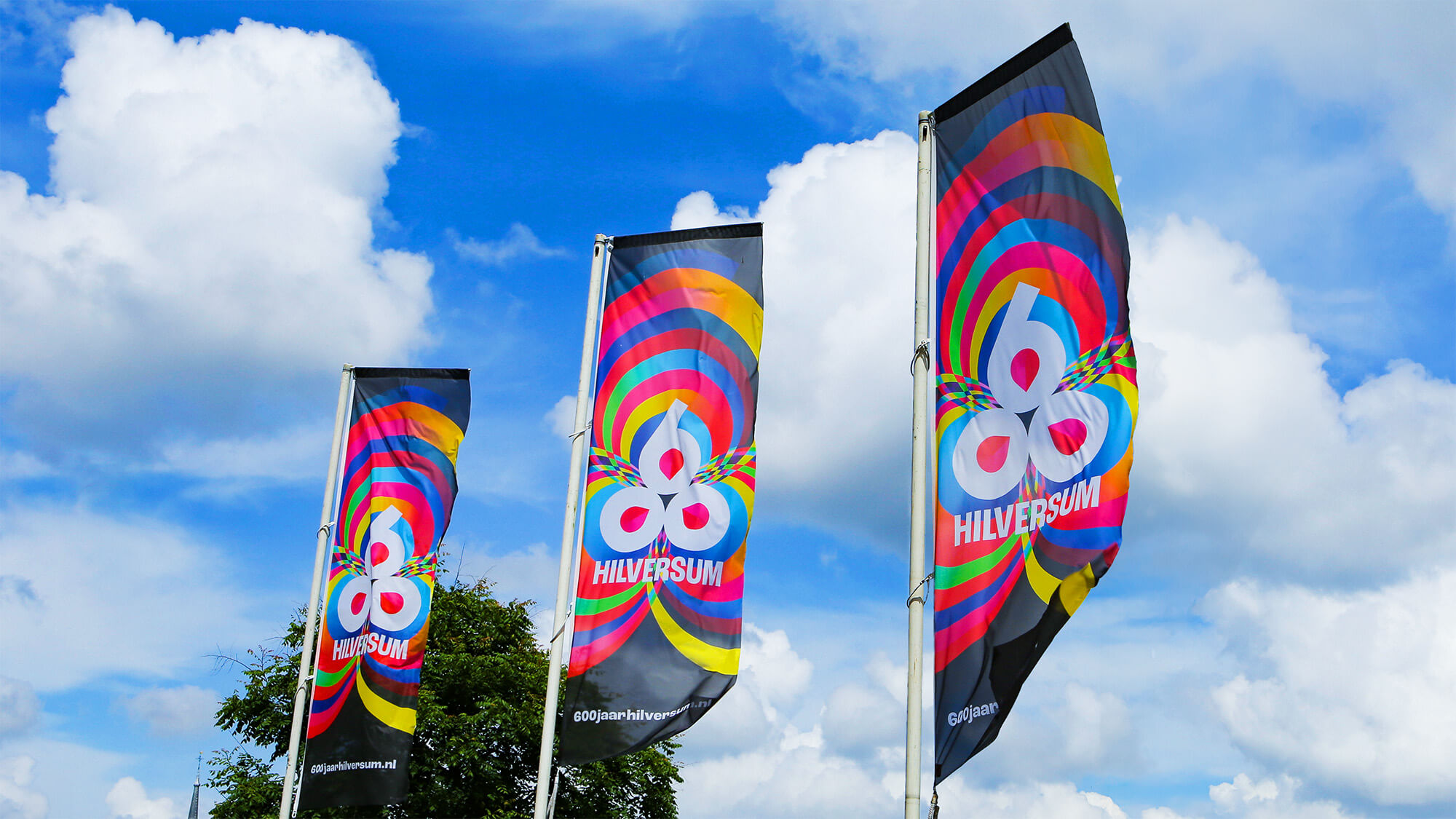
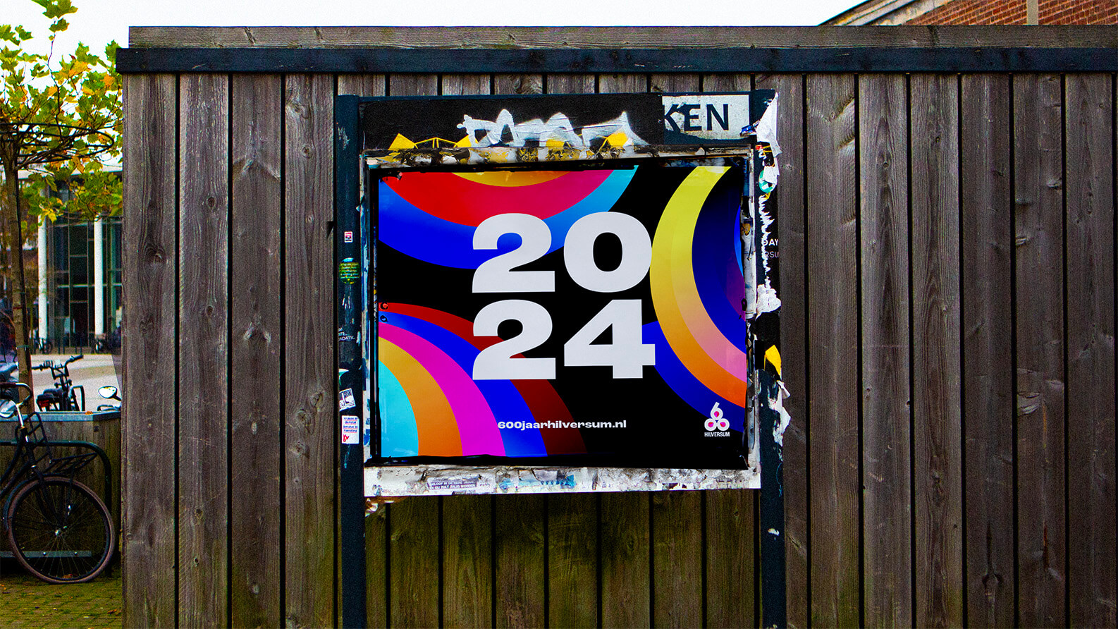
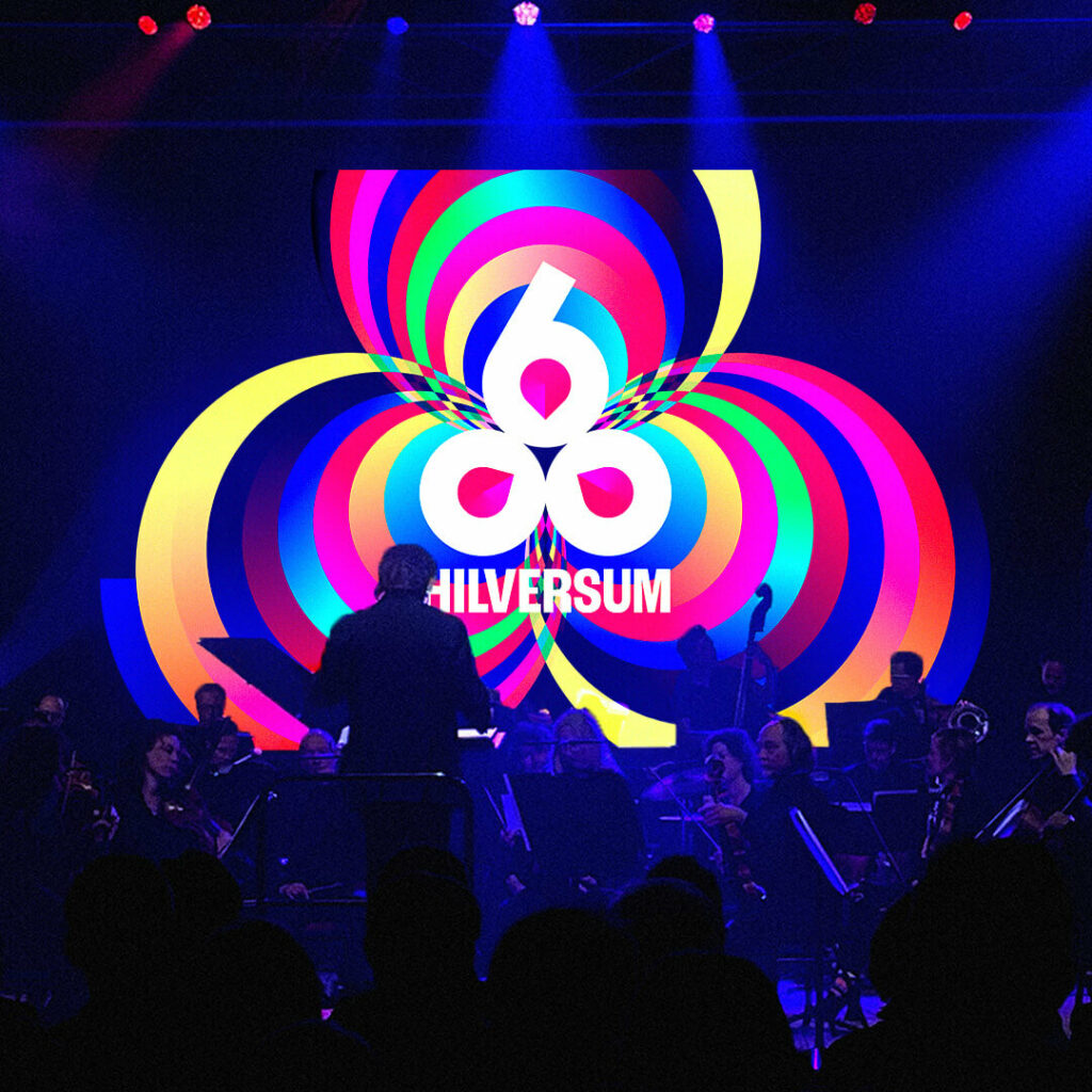
The identity is built around tree rings, symbolizing Hilversum as a city in motion. Just as trees form rings and grow, Hilversum continues to evolve. Where the rings overlap, new shapes and colors emerge, visually representing collaboration and cross-pollination. The logo incorporates bookweed grains from the city’s coat of arms, while the vibrant color palette reflects media, diversity, and energy, a nod to Hilversum’s role as the media capital of the Netherlands.
Result
Hilversum’s anniversary branding became a city-wide symbol. Used by the municipality, local initiatives, cultural organizations, and community groups, the identity strengthened the sense of connection and participation, ensuring 600 years of Hilversum was not just a celebration, but a collective movement.