


An Identity Born from Sound
Innovative design for Metropole Orkest wins Red Dot Award
It’s the only orchestra where you’ll find a classical violin next to an electric guitar. That’s how Metropole Orkest describes itself, and that kind of positioning calls for equally boundary-pushing design. Holland Centraal created the orchestra’s new visual identity, which has now been honored with a Red Dot Design Award.
We spoke with Philine Hofman, Marketing & Development Manager at Metropole Orkest, about how the design came to life and the impact it’s having in practice.
The search for recognition
“Over the last 10 to 15 years, Metropole Orkest has gone through an enormous transformation,” Hofman begins. “We evolved from being a broadcast orchestra for light music to becoming an innovator and driver of the international music scene. Our previous identity from 2012 simply no longer reflected who we are.”
A stronger positioning was needed, especially to challenge a persistent misconception. “People tend to associate orchestras with classical music,” Hofman explains, “while we actually play everything from pop to hip-hop. We needed an identity that broke away from that traditional image.”
The orchestra’s versatility, with its endless collaborations and musical styles, also presented a design challenge. “In the past, our visual presence would sometimes fade into the background when we worked with artists, the branding would often center around them instead.”
Holland Centraal and Metropole Orkest worked closely together in search of a recognizable identity that would amplify the atmosphere of every collaboration, a visual tone that always resonates, whether it’s with the raw power of Anouk, the virtuosity of Dweezil Zappa, or the distinctive jazz of Cécile McLorin Salvant.
A dynamic, adaptive identity
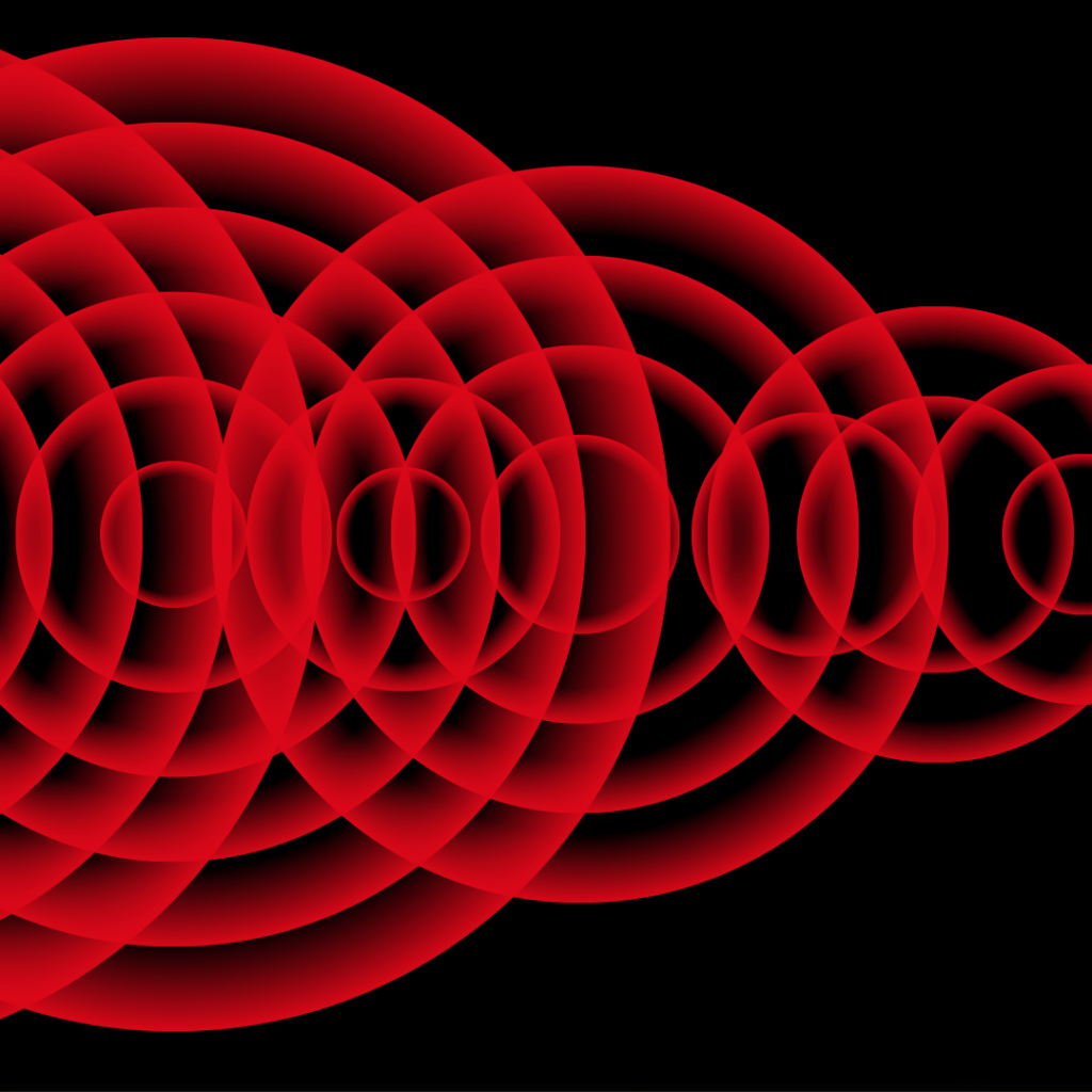
The result is an elegant yet powerful solution: a dynamic identity literally driven by music. An algorithm translates sound into a distinctive visual language.
“It’s an adaptive system,” Hofman explains. “The colors and motion adapt to the artist, but the forms and typography make the orchestra’s presence unmistakable. Our identity is now as strong as the artist’s. You can always sense the joint effort.”
Real-world impact
The new identity was instantly embraced, Hofman says. “We keep hearing that it finally reflects who we truly are.” The practical benefits are just as significant. “We can now generate visuals ourselves, which gives us more flexibility, and saves both time and costs. The identity is also strong enough to stand on its own, which is essential when we’re not collaborating with other artists.”
The Red Dot Design Award shows that the rebranding hasn’t gone unnoticed internationally. “It’s wonderful recognition for our new positioning,” Hofman concludes. “Or, as our chief conductor Jules Buckley calls it: music with a groove.”
Thanks to its new identity, that groove is now not just heard, but seen.